Portrait of Morgan Keys

Hi, I'm Morgan

Product Designer, AI Builder

I help design teams solve their hardest use cases by combining curiosity, craft, cutting-edge tools, and a focus on how real people think and work. Whether it’s file sharing, government budgets, construction projects, or cybersecurity, companies lean on me to bring clarity and creativity to the hard problems of complex industries.

Design & AI

I believe that AI can help Design as a function reach its full potential. Modern AI tools allow designers to move into higher fidelity outputs—instead of reviewing static mockups or simple click-throughs, designers can now experiment and test at full fidelity. Designers can also build more intuition about the medium they design for, and ultimately create better, more realistic, and more innovative work.

Let's chat

If any of this sounds interesting, if you are building complex workflows for specialized industries, or if you're looking to improve your design processes for the AI era, please reach out. I'd love to talk about products, design, AI, and how we realize the potential of this new era in real, everyday workflows.

Contact me
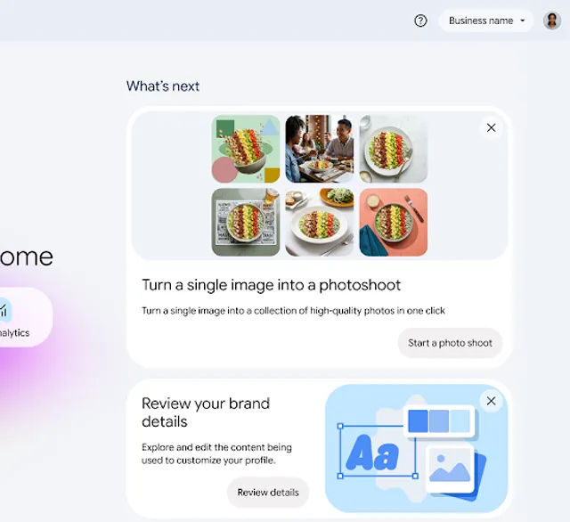
Welcome to Business Home, with shortcuts to create content, manage locations, and view analytics

Business Home

Google | Summer 2026

Helped launch a new product for local merchants that featured generative AI. Prototyped and delivered critical flows for a quick 6-week turnaround, coordinating with multiple product teams.

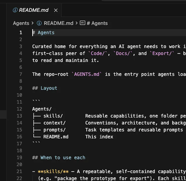
Editor showing the AI prototyping kit repository

AI Prototyping Kit

Google | Summer 2026

As part of an internal push to transform design workflows, I developed a customized AI prototyping kit. I built a well-structured codebase, using design tokens and skills to improve Gemini's outputs. The results were faster to build and more consistent, enabling deeper design review and better engineering handoff.

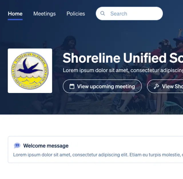
Mock-up of a school district website built on Boardable's public education sites

Public Ed Sites

Boardable | Summer 2025

Working quickly to meet a market opportunity, I crafted both a public-facing, customizable page and the admin experience behind it.

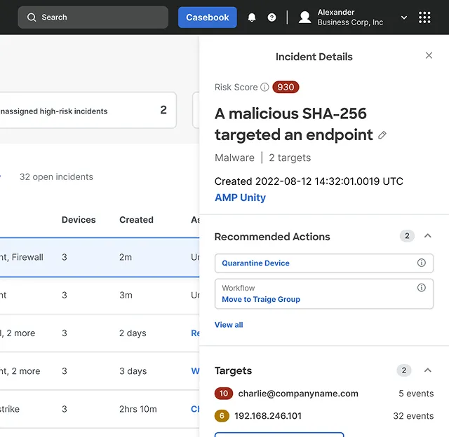
Cisco cybersecurity incident details dashboard

Cisco XDR

DesignMap | 2022

Led a team in redesigning Cisco's cybersecurity platform. Combined various complex tools into a unified, streamlined experience.

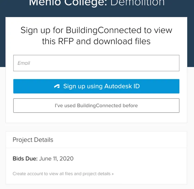
BuildingConnected sign-in screen used in Autodesk SSO

Autodesk SSO

Autodesk | 2020

Seamlessly integrated a critical sign-up flow, paving the way for long-term platform unification.

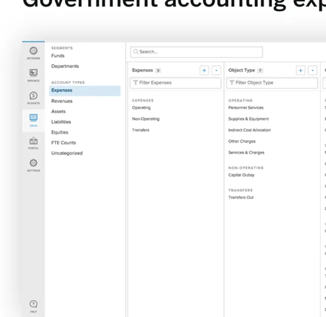
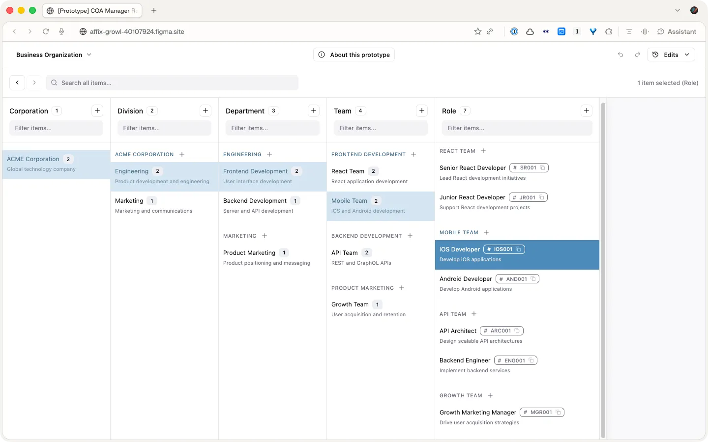
The OpenGov chart of accounts manager

Chart of Accounts

OpenGov | 2016

Redesigned the tool local governments use to structure their financial data. Months of research into an esoteric accounting concept led to the “slot machine” — a dynamic, spreadsheet-like view of nested taxonomies that users picked up naturally and that earned OpenGov a patent.

Public servants

OpenGov's primary users are the public servants who run local governments. This includes elected officials like mayors, but the more common day-to-day users are department heads, analysts, accountants, and finance directors. My work primarily focused on accounting and finance users. These individuals are risk-averse and detail-oriented, yet they take pride in their work, viewing it as their solemn mission to present financial data in a way that is understandable to their staff and the public.

A finance director

Financial transparency

Local governments upload large amounts of data to OpenGov on a quarterly or monthly basis, using the platform to share interactive reports both internally and publicly with the citizens they serve. Due to the complexity of financial data, the usefulness and accuracy of these reports heavily depend on how the data is categorized. Sophisticated categorization schemes are created in enterprise resource planning systems and must be mirrored in OpenGov. The categorization scheme for an organization is referred to as a "chart of accounts."

An OpenGov transparency report

Taxonomies

A chart of accounts is a long-standing, esoteric accounting tool, essentially a series of taxonomies. An easy analogy for the average person would be the classification of animals: just as scientists categorize animals into groups, accountants do the same for transactions. However, in accounting, multiple taxonomies are used for each transaction, and the structure can vary from one organization to another or even based on the type of report. A small government might use three taxonomies, each with 2-3 levels, while more sophisticated governments could have 4-5 taxonomies with up to six levels. We often encountered charts that tracked tens of thousands of types.

A taxonomy of animals

The legacy solution

OpenGov already had an existing tool for managing charts of accounts, built as an MVP in the early days of the startup. The tool made certain implementation assumptions that required these taxonomies to be handled separately. It also used a folder-like interface that did not accurately represent the data and, due to a lack of error handling, allowed users to make nonsensical edits and accidentally corrupt their data. When I was assigned to redesign the chart of accounts manager, there were aspects we couldn't change, but we could improve the user interface.

The legacy chart of accounts editor

Listening and learning

Aside from a background in math and a curiosity for data structures, I had little relevant experience for this project. My first step was to listen and learn. Luckily, we had retired finance directors on staff with decades of experience, as well as a team of technical support staff who interacted with customers daily, training them and solving technical challenges. I set up learning sessions and made countless desk visits. I also took the opportunity to join customer calls to learn directly from customers, listening for the kinds of questions they asked Customer Success and then asking questions of my own.

Becoming an expert

Given the complexity of this tool and the data it managed, I had to grapple with the subject matter. I began diagramming concepts, initially just to help articulate ideas to myself. I shared these diagrams with the Customer Success teams for feedback, prompting great discussions. We also realized these documents could serve as training tools, as I was not the only team member struggling to learn these concepts. Ultimately, the Customer Success team began distributing these documents to customers as well. Over the course of this project, and in my later work, I became one of the company's chart of accounts experts.

Diagrams explaining chart of accounts concepts

Early concepts

Once I felt I was beginning to grasp the concept of a chart of accounts, I looked for ways to better represent it in the interface. Inspired by a popular data visualization library, I mocked up an interface that represented taxonomies as a dendrogram. It was an exciting approach, offering an unprecedented bird's-eye view of the chart of accounts. However, there were serious problems. First, the tree-like organization made it difficult to view the entire categorization for a type—something critically important in a taxonomy. Second, illustrating the connections meant that text was not packed tightly, making it hard to see thousands of nodes in a readable way.

An early dendrogram concept

Back to the drawing board

One of my favorite, underappreciated research methods is artifact analysis. By examining the files and objects that people use to perform their work, you can gain valuable, tacit insights. I analyzed the spreadsheet files that users were uploading to OpenGov, trying to understand how information was laid out. I realized that spreadsheets did a great job of displaying taxonomies in a compact, readable, and easy-to-manipulate way. The only drawback was that the row-column grid required labels to be repeated when many categories were grouped under a parent, leading to visual noise. It occurred to me: what if we could create something dynamic?

A customer spreadsheet used for artifact analysis

A new concept

Imagining a dynamic spreadsheet with columns automatically scrolling to show relationships, I mocked up the new concept. It was a challenging idea to communicate abstractly, so I tried various methods to explain it, including Framer, animations, and even simple HTML/CSS prototypes. The concept became known as the “slot machine” due to the way it synchronized. Eventually, I paired with an engineer who built an early alpha version for testing.

The slot machine concept

Usability testing

I traveled with OpenGov account managers to visit local customers and test with live users. I used a short pre-interview script and ran a standard task-based usability test. The goal was to assess if users could understand what the interface was communicating and if they could successfully perform basic editing and navigation tasks.

The results were very positive. Especially considering the unique approach to visualization, it was exciting to see how naturally users picked it up.

These tests validated the concept, but they only covered basic tasks. We later learned the heaviest use came from people editing hundreds of accounts at once.

Working with Customer Success

OpenGov is an enterprise sales company, which means that account management and Customer Success play a huge and ongoing role in the customer experience. In fact, many customers, due to busy schedules or a lack of tech savvy, relied entirely on Customer Success to handle the technical work necessary to set up their accounts. This included working with the Chart of Accounts Manager.

And though I had spent many hours speaking with and learning from Customer Success, it became clear that they were the true power-users and I would need to learn their day-to-day workflows as well.

Based on learnings from 1-on-1 work sessions, I designed several features that enhanced their ability to search and make bulk-edits. One such feature allowed users to apply multiple filters at different levels, meaning they could quickly target a set of items and then easily move them to a new parent.

These features opened the door to the tool’s ultimate success.

Impact

The new design replaced the old editor and became the workhorse of the OpenGov platform. It enabled Customer Success to efficiently support customers and make chart of accounts manipulation accessible to more end-users.

Many users reported moments of delight when trying the new tool. They seemed to have small epiphanies, as if to say, “oh, right, that’s how it works.” In the world of accounting software, this may be one of the only tools that is actually fun to use.

The tool also made some surprising achievements. First, even though the tool was typically packaged with the platform, one customer opted for a special contract, paying $42,000 for just the Chart of Accounts Manager. Second, the novelty of the user interface combined with some of the technical achievements in its engineering won OpenGov a patent (US 10,552,995).

The alpha build in testing
The rebuilt prototype

What do you want to chat about?

Case study decks

Interactive demos

OpenGov chart-of-accounts manager prototype

OpenGov CoA Manager

Figma Make

Simplified for general audiences. Explore the unique interaction paradigm that earned OpenGov a patent.

OpenGov Network prototype

OpenGov Network

Figma Make

A recreation of the MVP I designed at OpenGov — a way to explore the OpenGov Network and browse municipal metrics.

Background

Career path

  • 3 scaling-stage startups, multiple exits
  • Large teams: Autodesk and Google
  • Strategic work at DesignMap
  • Long track record of building tools and design systems

Academic background

  • Dual Bachelor's degrees in Math & Creative Writing
  • Master's from University of Michigan's School of Information (Human-Computer Interaction)
  • Master's specialization in decision science
  • Interests in statistics and agent-based modeling

Earlier work

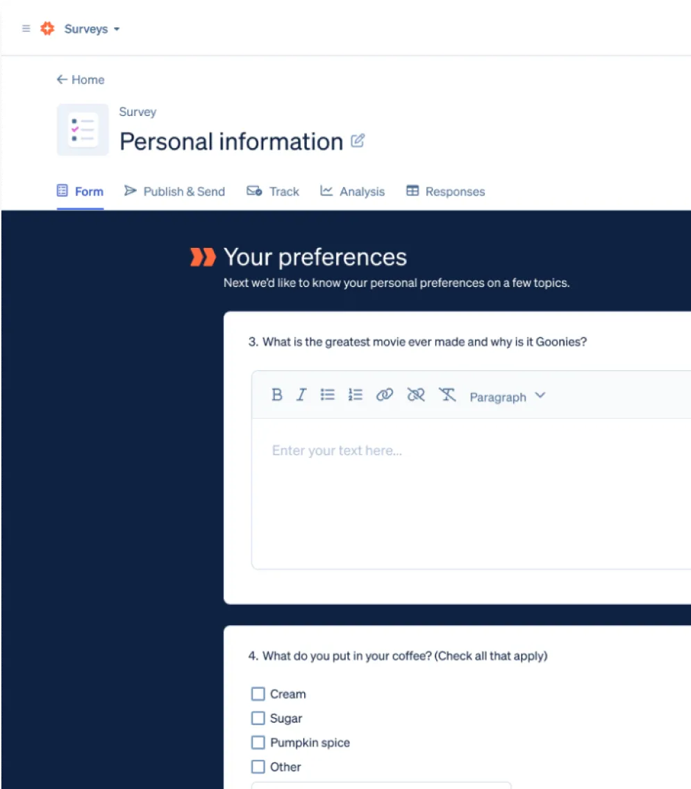
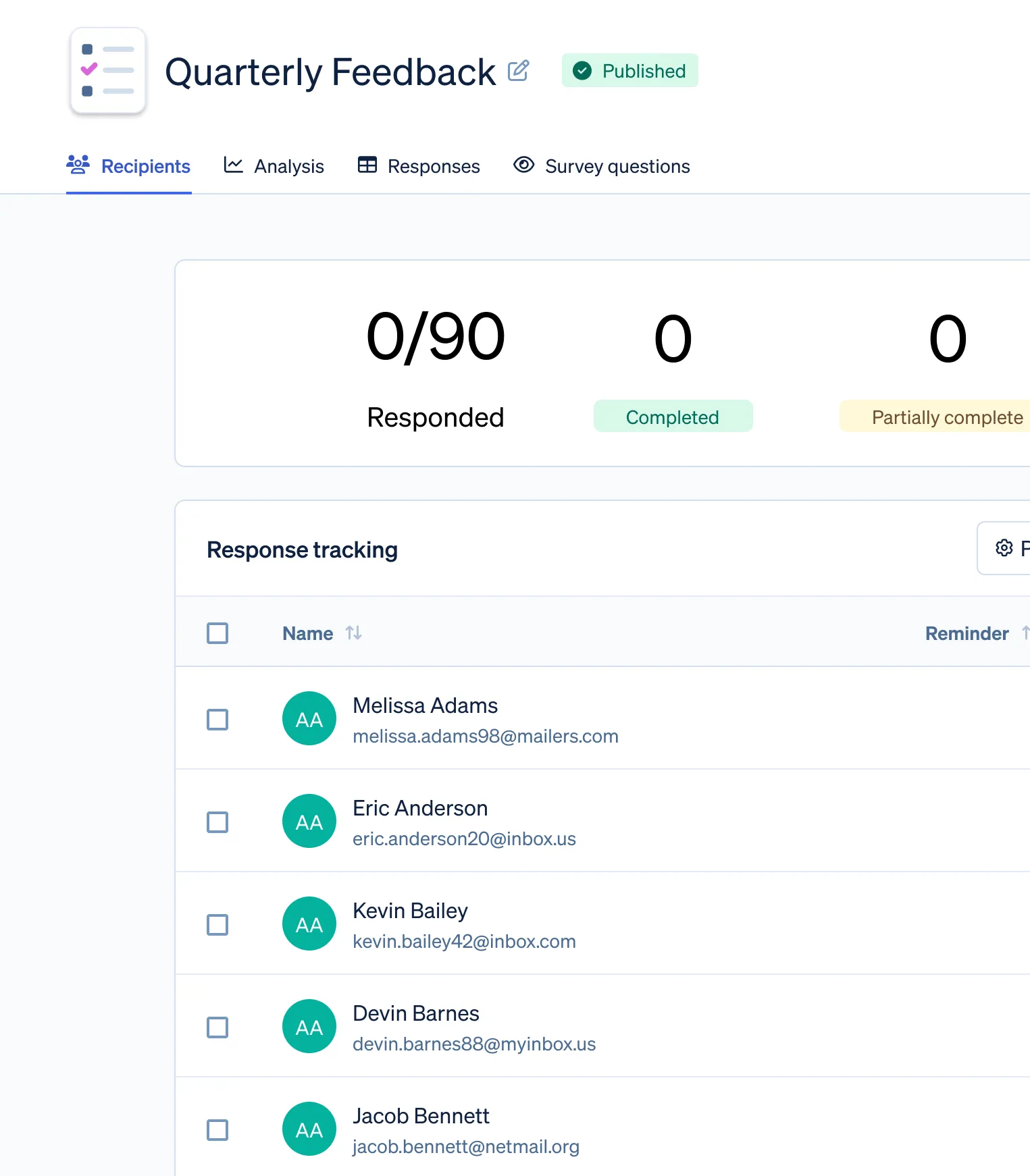
Boardable Surveys

Built a survey product that expanded Boardable’s platform, and designed a new navigation model to support distinct products.

Opened a new line of business and expanded Boardable from a catch-all app to a platform.

Boardable, 2025
Boardable Surveys interface
Boardable Surveys feedback dashboard

AI Minutes / AI Meeting Assistant

Designed a flow for generating, reviewing, and editing AI-written meeting minutes, plus an in-meeting AI assistant.

Boardable, 2025
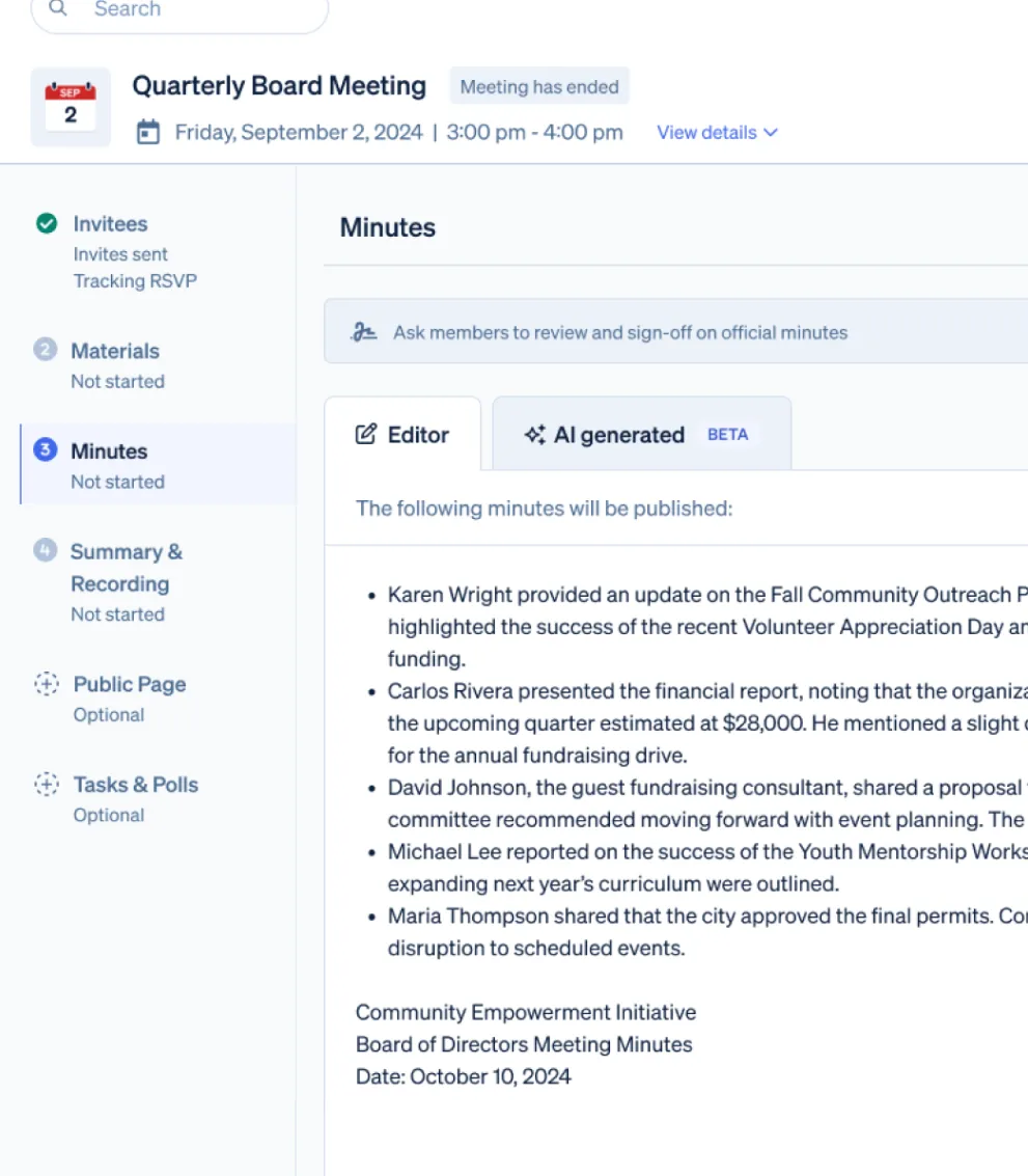
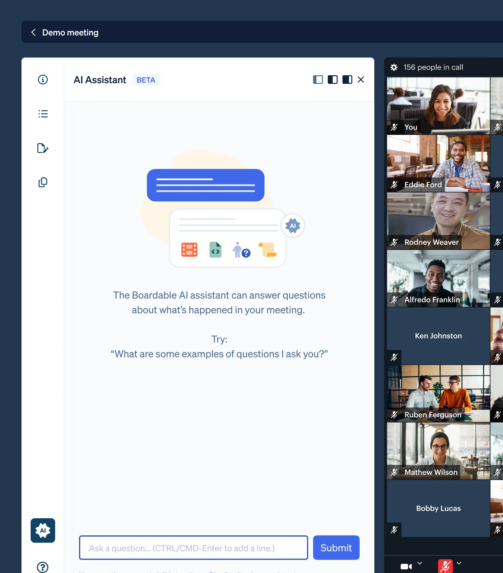
AI meeting assistant primary view
AI meeting assistant detail

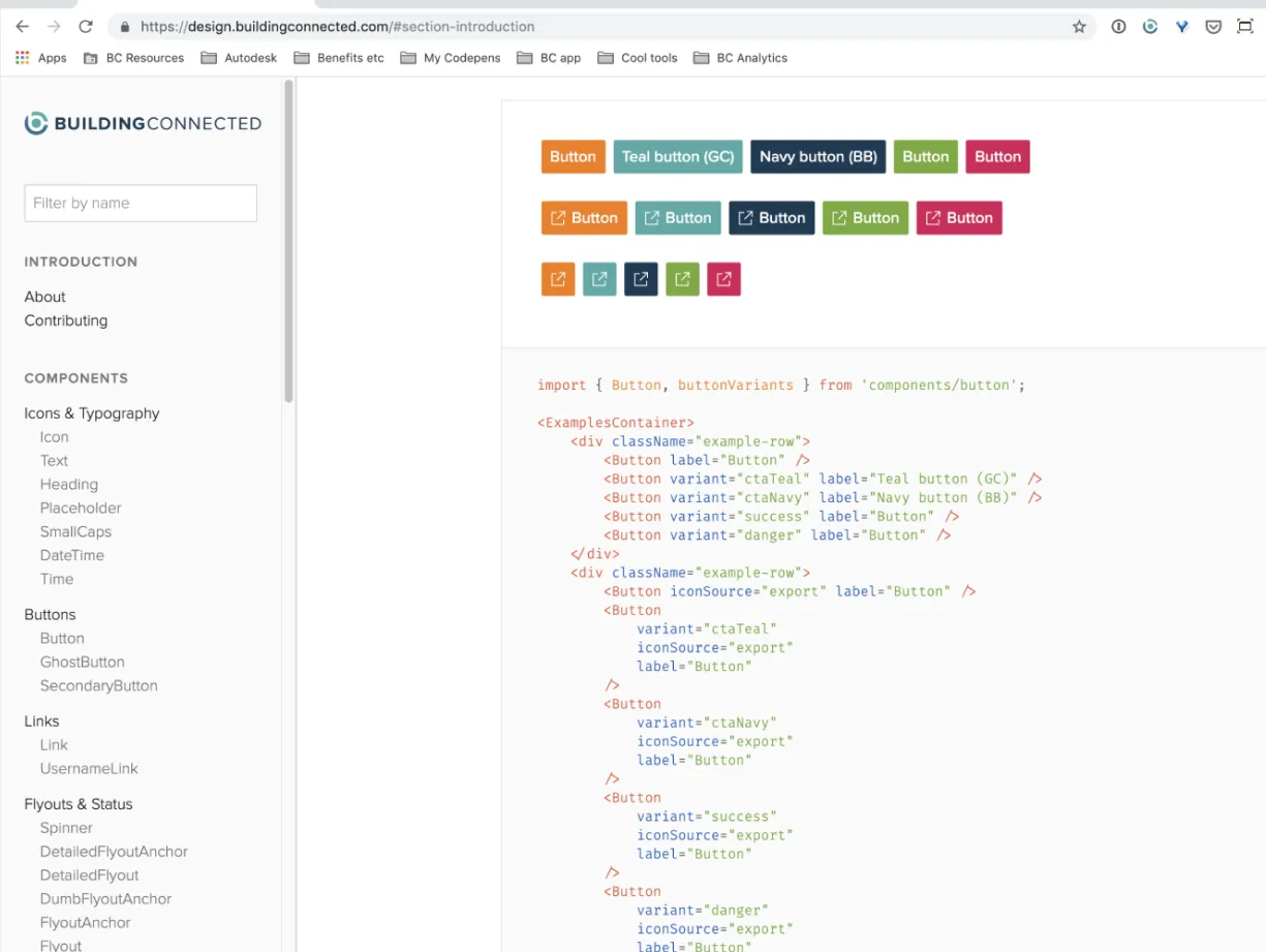
Design Systems

Evolved a Sketch library into an integrated design system.

Worked closely with the front-end engineering team to develop a standardized style guide and component library. Evangelized design systems to designers and engineers.

BuildingConnected, 2018
BuildingConnected design system site showing button variants and their React code
Design system Sketch library
Design system Styleguidist

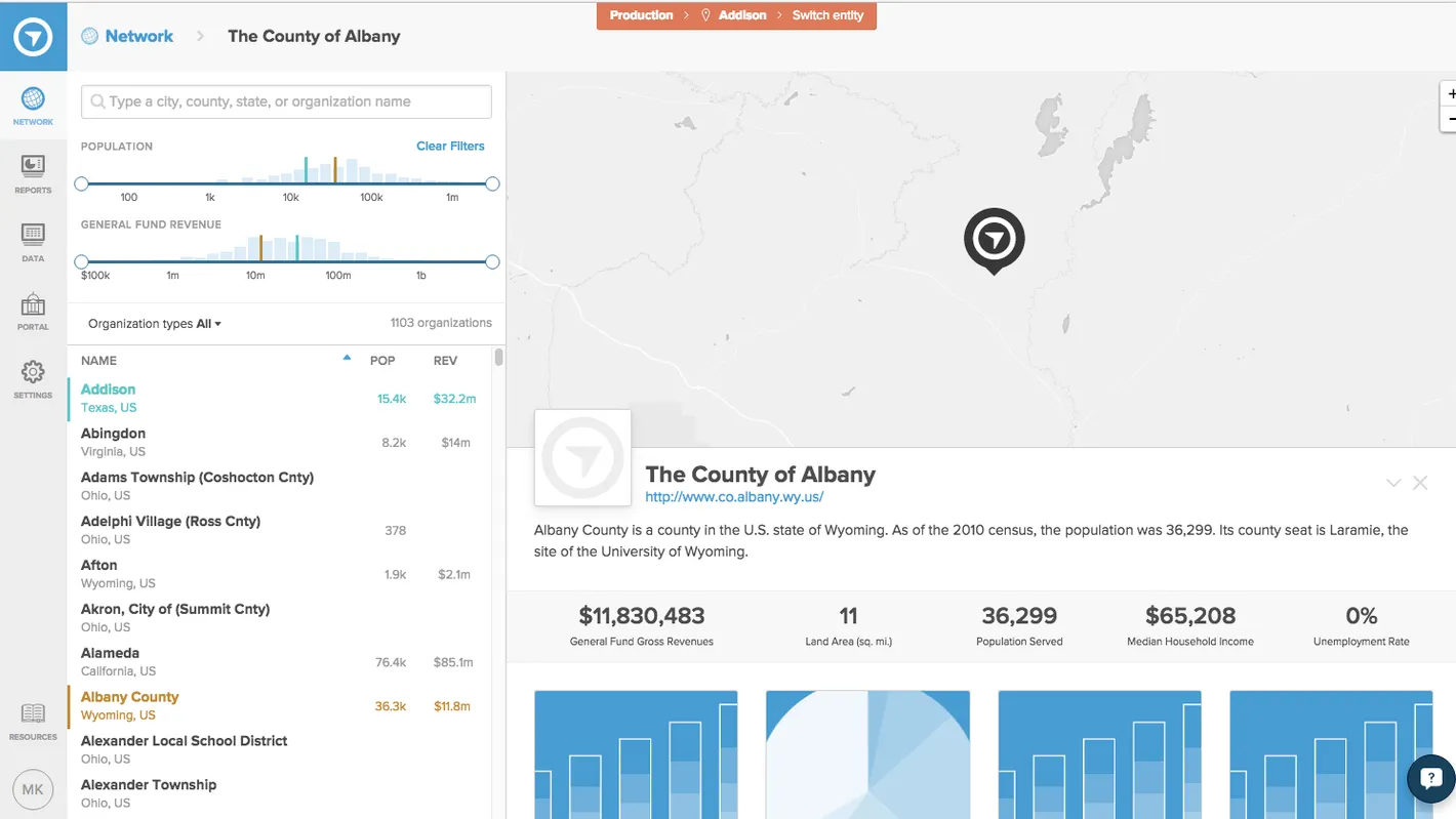
OpenGov Network

Designed a way for governments to find and compare peers on the OpenGov network.

Delivered a new app for the OpenGov platform that strategically leveraged and promoted platform capabilities.

View a recreation of it here.

OpenGov, 2015
OpenGov Network map and searchable list of governments, with a profile of the County of Albany

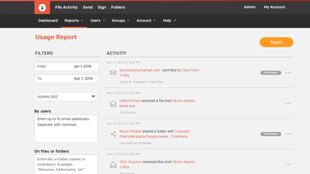
Hightail Enterprise

Designed an admin feature that helped enterprise accounts meet e-discovery requirements, giving admins a simple yet powerful way to monitor activity.

Enabled the Hightail Enterprise offering, a new strategic line of business.

Hightail (formerly YouSendIt), 2014
Hightail Enterprise reporting

Hightail Uplink

Championed reviving a popular legacy feature, then designed onboarding and engagement flows that added 8,000 users and 45,000 file sends in the first three months.

Hightail (formerly YouSendIt), 2013
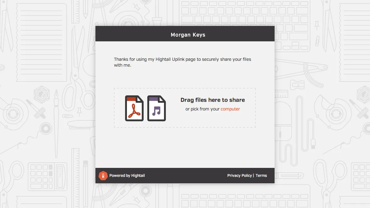
Hightail Uplink page where visitors drag and drop files to share

Ready to chat?

Find me on the socials:

Or shoot me a message: